Data Professionals Survey Dashboard (Power BI)
At a glance
- Project: Interactive dashboard
- Date: January 2026
- Category: Data visualization
Project overview
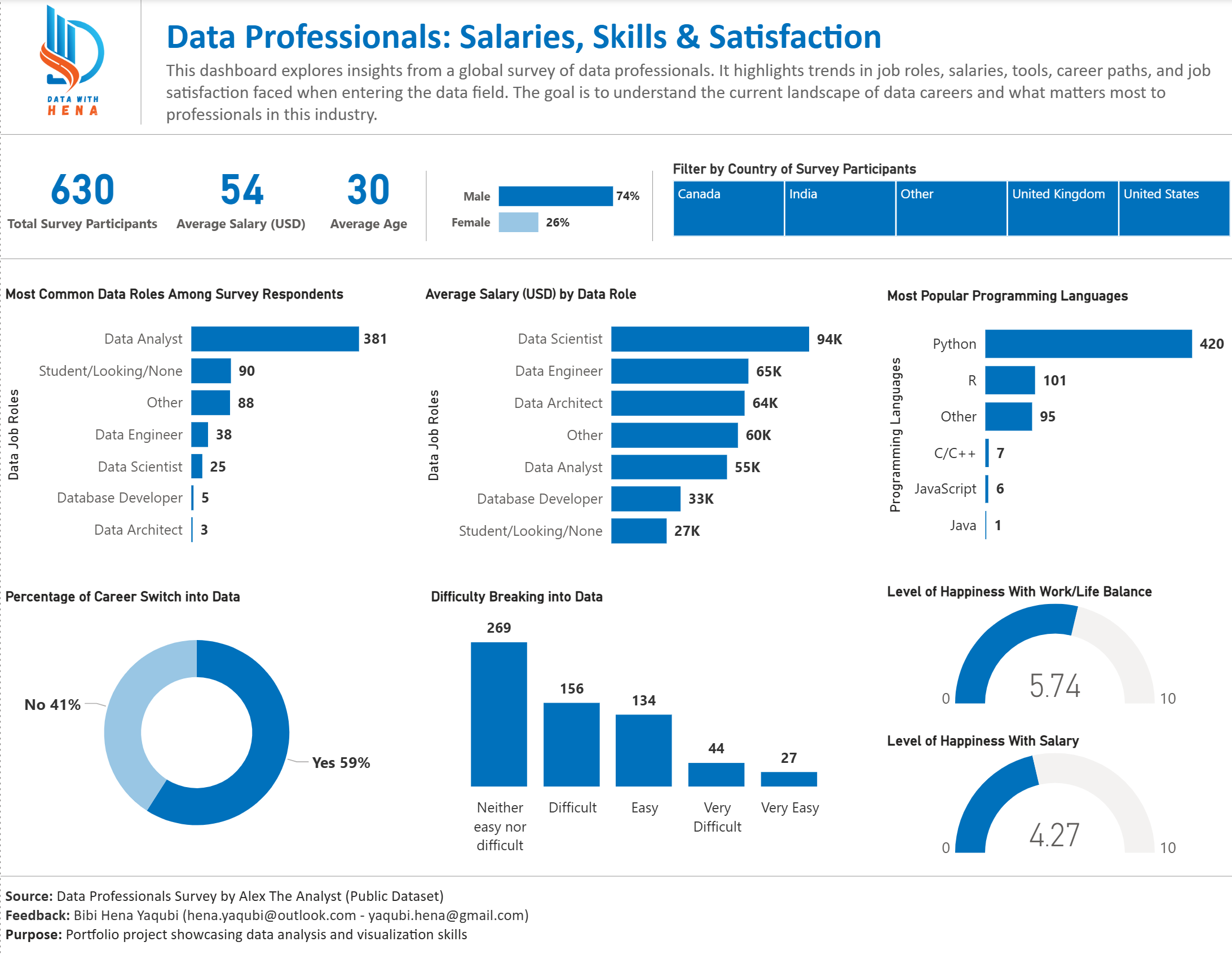
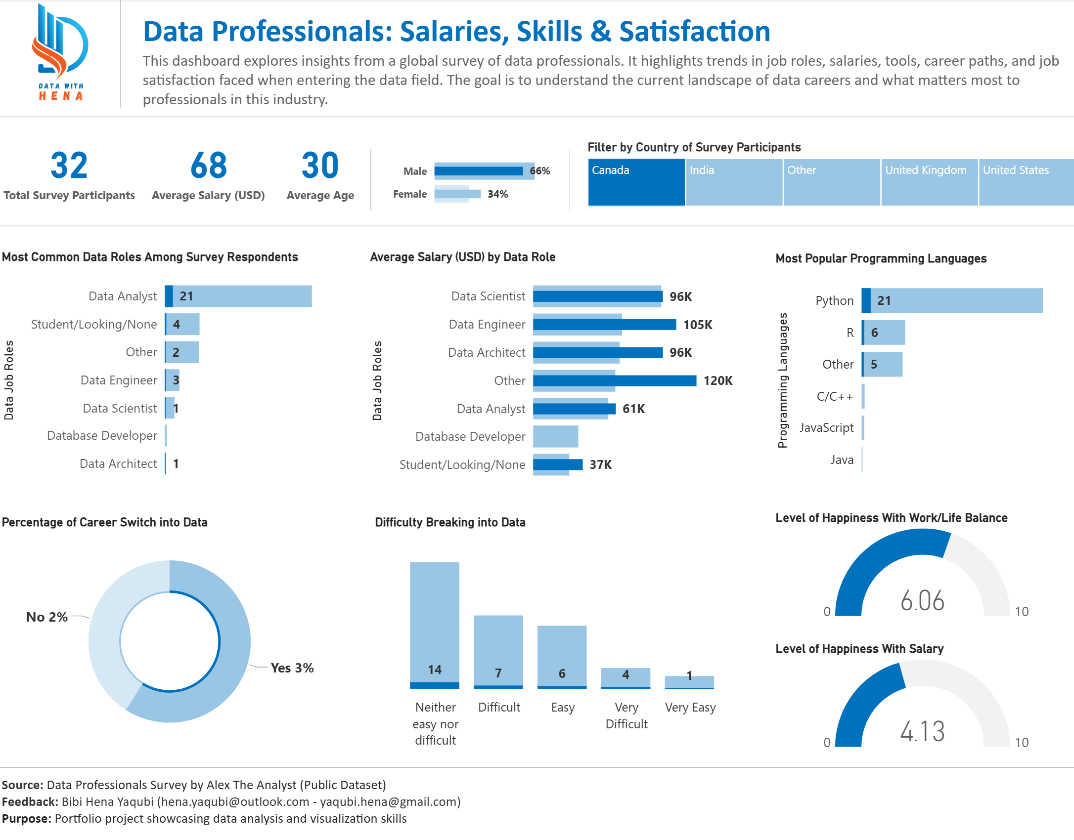
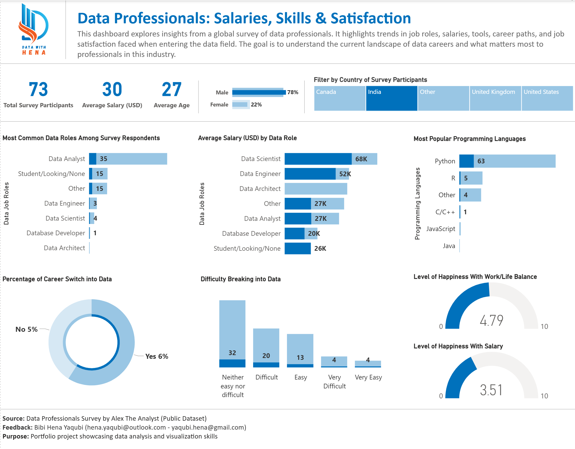
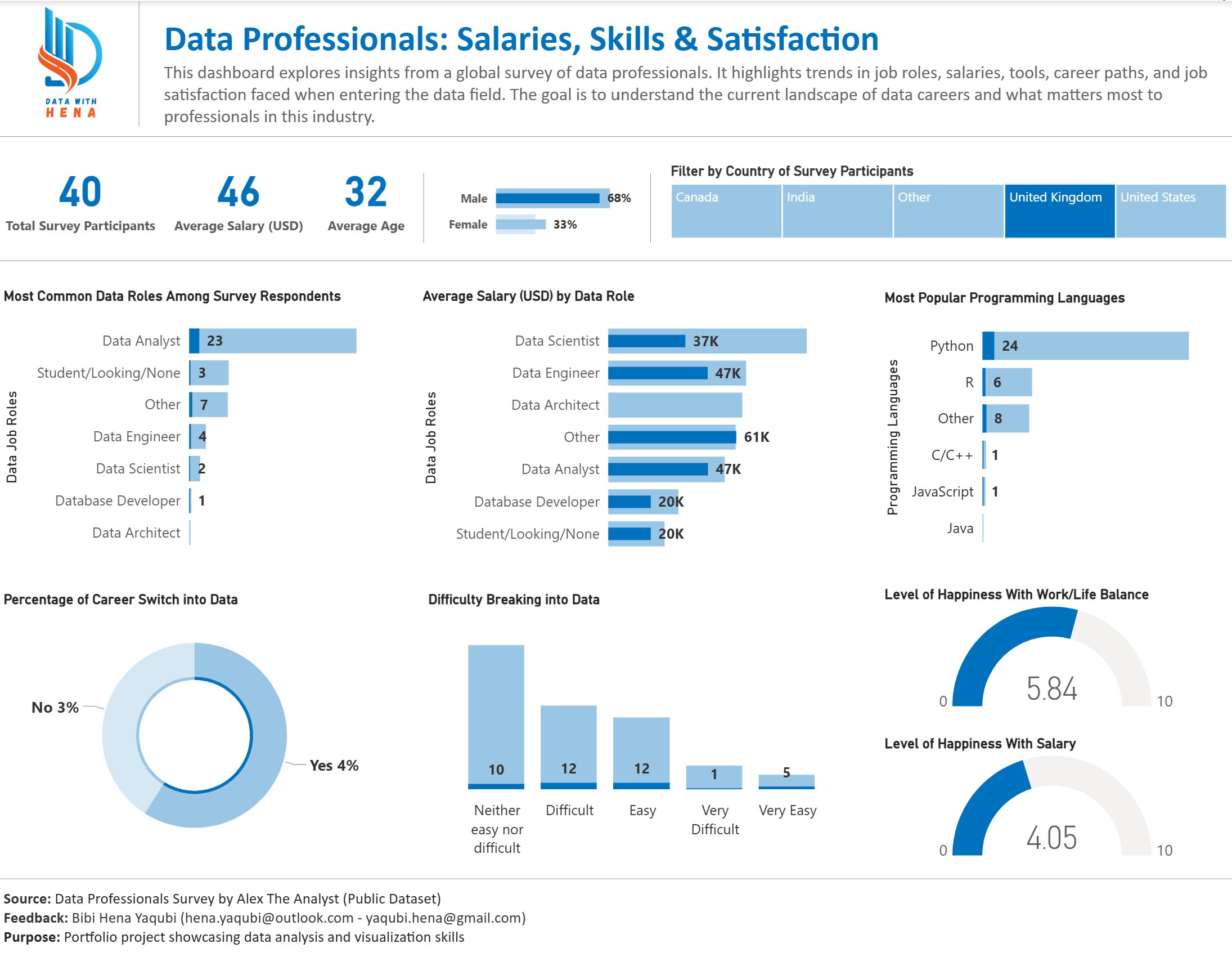
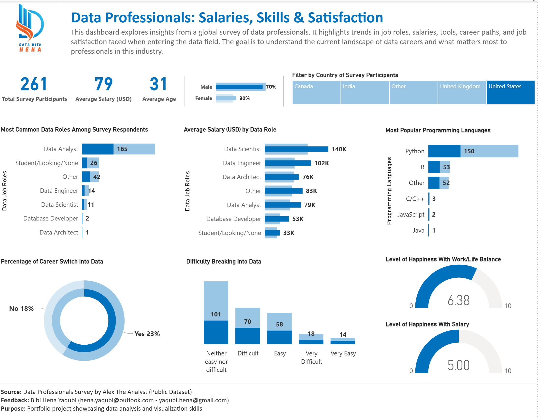
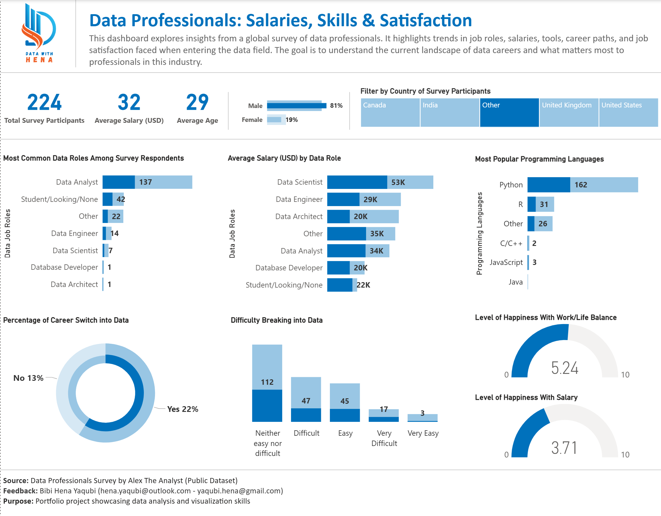
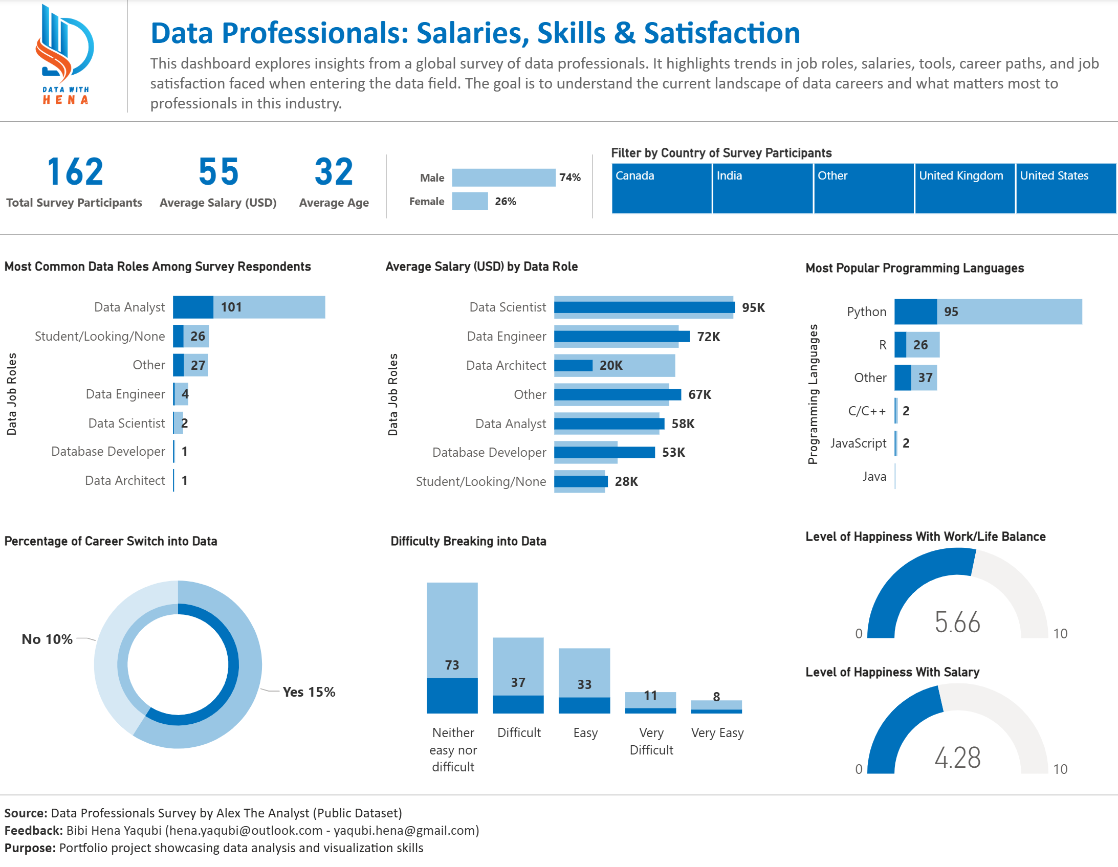
This project analyzes survey responses from data professionals to uncover industry trends and career insights. Using Power BI, an interactive dashboard reveals salary patterns, job roles, skills, and satisfaction across the data field.
The report helps professionals and hiring managers see compensation trends, popular programming languages, and career transition paths in one navigable view.
Dataset / source
Public survey of data professionals (Alex The Analyst), prepared as a structured dataset for Power BI.
Tools used
Power BI, Power Query
What problem you solved
Survey responses needed to become a single, filterable view of roles, pay, skills, and satisfaction so users could understand the data industry at a glance.
Key insights
- Salary
Compensation patterns by role and experience. - Roles
Distribution of job roles and titles among respondents. - Languages
Which programming languages professionals use and prefer. - Careers
How people move into and within the data field. - Satisfaction
Job satisfaction and related factors.
Embedded project
There is no public embed for this Power BI file on this site. Due to platform limitations, the report is documented with static screenshots below. The full interactive version is available upon request.
Explore More Projects
Discover other data analysis projects and interactive dashboards
View All Projects